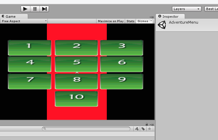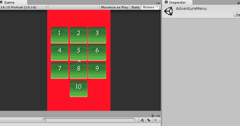
 Well with unity3D, I am in big trouble whenever I use sprites. As for textures I compensate for a evener look by Stretching it (Screen.width & Screen.height- that's fine for low end 2D games). Now If I have an Image and based on content of Image (Let's say I want to add BoxCollider for the walls in image). It works, but for only one aspect ratio. As I am making game for Android. I am having bunch of different resolution & Aspect ratios. Is this possible to stretch my coliders or other game objects so that I can Work easily????
please help me. I am in a rush :(
-
\$\begingroup\$ Can you provide us with more explanation? Maybe even a picture of what you get now and what you want to happen? There are numerous ways to deal with different aspect ratios and it is not clear to me know how you want your solution to look like. \$\endgroup\$– Roy T.Commented Apr 16, 2014 at 14:33
-
\$\begingroup\$ ok !!! Let's Say I set my camera value to 8 to fit in the Potrait mode. It's Look Good, But for 16:10 It Looks bad :( besides the collider works only for the potrait mode \$\endgroup\$– Adnan NazirCommented Apr 16, 2014 at 14:38
-
\$\begingroup\$ edited my Question \$\endgroup\$– Adnan NazirCommented Apr 16, 2014 at 14:41
1 Answer
I have a 'full width UI' script that deduces the aspect ratio of the screen relative to some reference screen dimensions, and adds a scale to the transform to compensate for a change in aspect ratio. Then I build my UI to the reference screen dimensions (in my case 1024 x 768). At runtime, the actual screen width is asked for, and the adjustment ratio calculated. E.g. if the screen width is 1280, then a ratio of 1280/1024 = 1.25 is needed. That ratio is set as a scale along the x axis on a transform which is the parent of all of my UI, effectively stretching it horizontally until it occupies the whole screen.
NB: This is separate from the code which scales the entire UI to fit the resolution (e.g. if the screen was set to 800x600 instead of 1024x768, then my UI needs to be scaled down by 0.78125 in both axes to occupy the same space. In practice, I handle that part by altering the camera projection, but I call it out because changing the aspect ratio is a separate thing than changing the resolution (because the latter needs to preserve the aspect ratio, not alter it).
-
\$\begingroup\$ what happens if the screens aspect ratio is wildly different from the reference dimensions, such as going from PC to Android? Wouldn't the stretching be horrid? \$\endgroup\$ Commented Apr 21, 2014 at 7:52
-
\$\begingroup\$ That depends entirely on what you're stretching. Bear in mind it's only getting wider, not taller. So if you've got a plain rectangle or a vertical gradient fill, as shown in the examples above, it doesn't matter how wide it is. Text or image content obviously wouldn't scale as nicely. But the question is about how do you stretch all things, including colliders, not how do you get it looking nice. That's a big can of worms, far larger than can be answered here in this format. \$\endgroup\$– MrCrankyCommented Apr 23, 2014 at 10:11
-
\$\begingroup\$ I should also point out that in my UI, things aren't always stretched. In fact stretching is a pretty rare case, only used for backdrops. But the same logic that checks for wider screen widths can be used to change the position of containers anchored to the left and right edge of the screen. Those containers wouldn't be stretched, just moved. So I can have a backdrop container, which gets stretched to occupy the whole width of the screen, a left container which gets shifted to -512 or -640, and a right container which gets shifted to +512 or +640. \$\endgroup\$– MrCrankyCommented Apr 23, 2014 at 10:15
