2
\$\begingroup\$

The background implemented in the game
(the background implemented in the game)

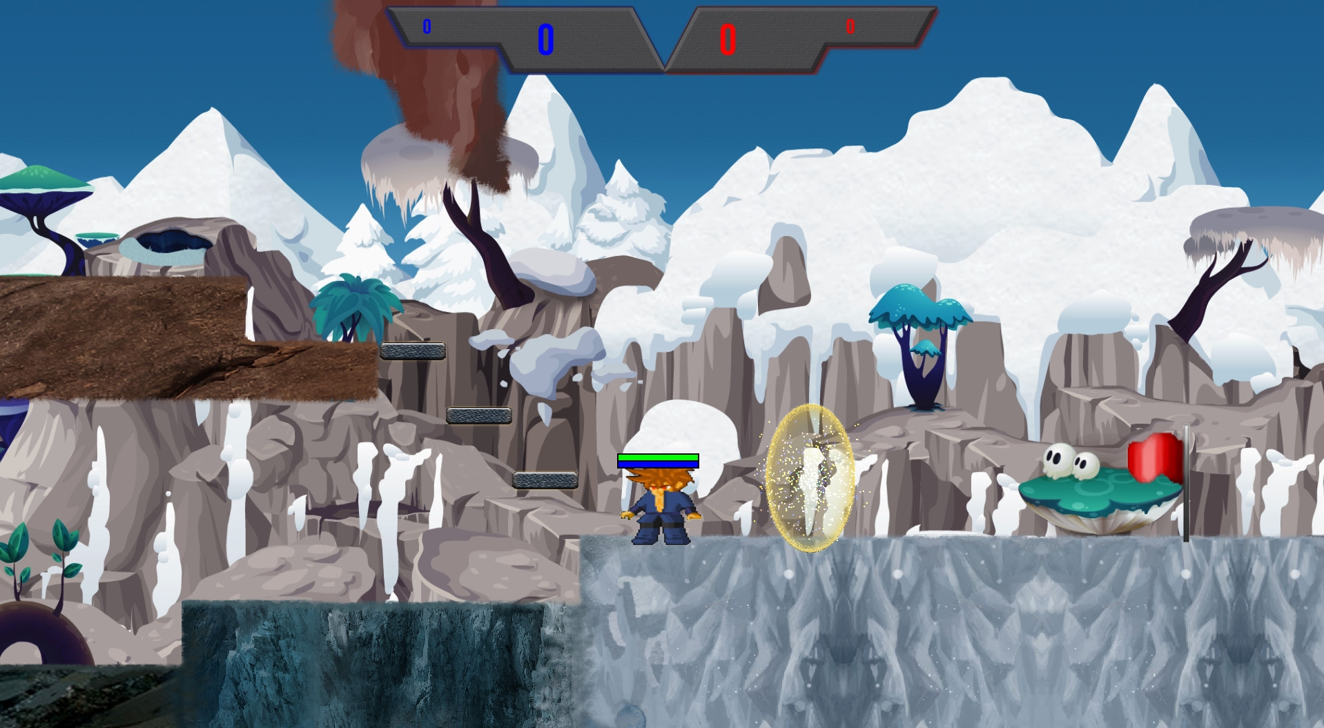
In the game that I work on, the background and the map tiles are pretty indistinguishable for new players, probably because they have similar colors and theme.

Are there any tips or tricks to make the background more like a background and be distinguishable from the map tiles?

The game has motion blur which kinda helps, when the player is running the background gets blurry therefore making it more distinguishable from the map tiles.
However, that is clearly not enough.

Any suggestions, tips or tricks will be greatly appreciated!

Just purely the background
(purely the background)


EDIT: Thank you for the suggestions and the ideas! here are some variations of this background that I came with.

darker and way more blurry
(darker and way more blurry)

dawn colors and some blur
(dawn colors and some blur)

one of the coolest things I've done + blur
(one of the coolest things I've done + blur)

one of the coolest things combined with dawn colors + blur
(one of the coolest things combined with dawn colors + blur)

\$\endgroup\$
1
  • 1
    \$\begingroup\$ Why the downvote? it is a legitimate game design question, combining a background and a foreground(map tiles) to look connected yet still distinguishable is not an easy task by any means. \$\endgroup\$
    – julian
    Commented Oct 15, 2015 at 1:32

3 Answers 3

2
\$\begingroup\$

Another option is to adjust your Hue, or colors in general, so that they are not the same color as your foreground elements.

enter image description here

Or you could try to give a bolder outline to the foreground elements to make them pop out at you.

However, in my opinion, this background is just way too busy and will be very difficult to differentiate from your foreground elements.

\$\endgroup\$
1
  • \$\begingroup\$ Changing the Hue is not something that I though doing, even though I did already 15+ variations of this background, will give it a go! \$\endgroup\$
    – julian
    Commented Oct 16, 2015 at 10:16
2
\$\begingroup\$

A good way to get an idea of how to make your foreground stand out from the background is to research similar games. If you look at games such as Sonic and Megaman, the backgrounds of the levels all appear either relatively darker or lighter than the foregrounds. In some cases, the background is blurred slightly, but this effect can have a negative impact on your game - what is the point in going through all the trouble to make a wonderful background if all you are going to do is blur it to make your foreground appear more prominent?

Additionally, in these games, the foregrounds are comprised of colors that compliment their respective backgrounds, and make them pop out. For example, if you had a prominently blue-colored background, one way to make your foreground pop out is to design it using warmer colors such as orange and yellow, because these colors complement the cooler blue colors. Castlevania did this exceptionally well:
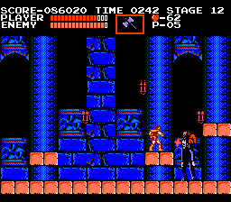
Castlevania

Also note that the colors of tiles in the foreground are considerably brighter than those in the background, as can also be seen in Megaman X:
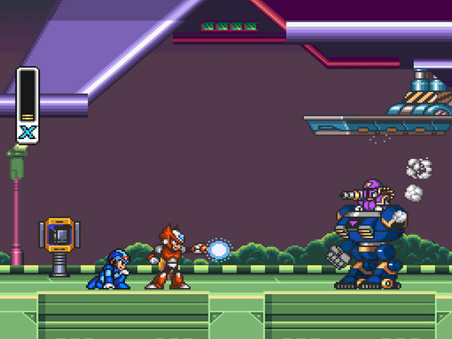
Megaman X Into Stage

I should also note that in these games, depending on the setting, their backgrounds mostly share certain aspects in common. For example, in levels that are outside in the open world, the background is considerably smaller and the sky (blue, possibly with clouds) takes up most of the space.

Additionally, as Alexandre Vaillancourt pointed out, there may possibly be too much detail in your background. It's all about finding the right balance. If you look at similar games, their background sometimes have a high level of detail, and what makes the foreground pop out, is again, the correct balance of colors, shade and detail.
\$\endgroup\$
2
  • \$\begingroup\$ Those are some great examples! Thank you for the tips! By the way I find Castlevania to have a very confusing background, but the Megaman X example is a great one! \$\endgroup\$
    – julian
    Commented Oct 16, 2015 at 10:14
  • 1
    \$\begingroup\$ Each to their own! You can only do so much with a limited color palette, as was the case back in the days of Castlevania. \$\endgroup\$
    – driima
    Commented Oct 16, 2015 at 10:38
1
\$\begingroup\$

I am not expert at graphic design so when i want to make a game i usually test the graphic resource that i made in the game, if something is wrong I change it until I have decent graphic design

here what i propose : test a lot of background until you find the right one

darker

enter image description here

blurr

enter image description here

with interference

enter image description here

and you have a lot of other options and also it will be great if you add darker borders to your ground images.

hope this was helpful !

\$\endgroup\$
1
  • \$\begingroup\$ Thanks for the ideas! I already did 15 variations of this background, I also deleted some of the details, and eventually managed to make a quite good variation which is what I use for the time being. \$\endgroup\$
    – julian
    Commented Oct 16, 2015 at 10:11

You must log in to answer this question.

Not the answer you're looking for? Browse other questions tagged .