10
\$\begingroup\$

I have a game with tiles. Each tile is a number, and each number is one of six colors. The color is important to the game play, and I want to make the game available to those who are color blind.

What would be a good representation for these colors so people with color blindness can play as well?

\$\endgroup\$
2
  • 4
    \$\begingroup\$ I'll just add this here since I don't want to create an answer around it: jfly.iam.u-tokyo.ac.jp/color/#select Someone else, feel free. \$\endgroup\$
    – House
    Commented May 16, 2013 at 20:44
  • 3
    \$\begingroup\$ I seems to remember that for The Legend of Zelda: Link's Awakening (which was released on the GameBoy) they used different shading to show different tile types. There's an example of what I mean over on the wikipdeia entry for it. \$\endgroup\$ Commented May 22, 2013 at 16:29

6 Answers 6

14
\$\begingroup\$

I don't know if there exists a set of colors that all people will be able to differentiate, whether or not they have any color-blindness.

It might be a better idea to use an additional indicator alongside color. I know that the Ticket To Ride boardgame uses a symbol on each of the different color cards, so that if someone can't tell the difference between two colors, they can look at the card and the board and see if the symbols match.

Another option would be to use patterns on the tiles. Stripes, wavy lines, cross-hatching, dots or diamonds are all different enough that a player could be able to tell them apart even if they can't tell what color they are looking at.

\$\endgroup\$
4
\$\begingroup\$

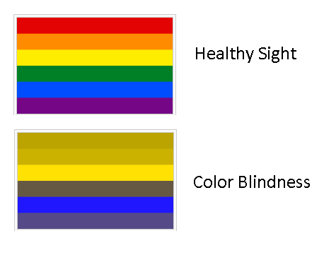
A color Blind person sees as shown on the picture below. I would say that you should leave out the green or purple colors, and make sure that the difference between each colour is big. If you need the players to distinquish the tiles for their colours, I'd simply make them use different types of textures straight lines, horizontal lines, circles, crossed lines, no lines etc.

There are different types of that illness, and choosing the right color would never suit everyone. http://simple.wikipedia.org/wiki/Color_blindness

The image below shows the most common color blindnes, whch is Red/Green color blindness.

From Wikipedia:

There are two kinds of red-green color blindness: protanopia or deuteranopia. Deuteranopia is the most common form of color blindness, between five and ten percent of males suffer from it. Those affected have trouble telling the difference between red and green. As seen by protanopes (people suffering from protanopia), red is darkened. Most often, this is because they lack the receptors for long (protanopia) or medium (deuteranopia)-length light waves or because these receptors have changed their sensitivity.

enter image description here

\$\endgroup\$
2
  • 1
    \$\begingroup\$ As you say yourself, there are several different varieties of color-blindness, so the 'healthy' vs. 'color-blind' chart here really isn't helpful - it only shows what one possible form of color-blindness will look like. \$\endgroup\$ Commented May 16, 2013 at 21:50
  • \$\begingroup\$ I will correct the ambigious part, I've forgotten to mention that the Red/Green color blindness is the most common form of the illness. \$\endgroup\$ Commented May 16, 2013 at 22:10
4
\$\begingroup\$

Silhouettes. Always silhouettes. Even if you don't care about color-blindness, every distance game element needs a distinct silhouette. Not just a glyph on the element, but a distinctly visual black-and-white outline.

For a game with tiles, consider non-square shapes. They can be square-ish, but have trapezoids and the like as well. Do not rely on the numbers. Do not rely on colors. Make the primary identification method the silhouette.

\$\endgroup\$
1
  • \$\begingroup\$ An interesting idea! I'll have to think about this one some more. \$\endgroup\$
    – fbrereto
    Commented May 21, 2013 at 22:01
4
\$\begingroup\$

This adds to Sean Middleditch's answer. The best you can do is to check for relative luminance contrast to distinguish each tile/shape. You can look up relative luminance of a color here (the Lum value). A good contrast distance is 30% to 40%.

\$\endgroup\$
2
\$\begingroup\$

Most colour blinds are dichromats, they can actually see some colour, but typically lack either red or green receptors. If you make a set of colours where the red and the green values are the same and the colours are clearly differentiable to you they should be so for most colour blinds as well.

If you only have a few colours, different shades of grey can work well enough for full colour blinds, but 6 different shades is probably a bit over the top. So you will have to use shapes or patterns for these.

I think shapes could work really well for the problem at hand, make 6 simple yet clearly distinguishable shapes, draw them either black or different colours on the tiles and put a white number on top.

No matter what you choose to do, ask some colour blinds how they like it and be prepared to tweak your solutions accordingly.

\$\endgroup\$
2
\$\begingroup\$

In designing a game with this in mind, I have used shapes that correspond to the colors. You can think of this in terms of "suits", with the numbers being "ranks", similar to a card game. Even if someone couldn't tell red from black, they could still tell a 4 of clubs from a four of diamonds by the shapes.

To make it easier for those with varying degrees of color blindness, you can make the colors used well differentiated in lightness. Someone who sees light red and light green as the same color can often tell the difference between dark red and light green.

\$\endgroup\$

You must log in to answer this question.

Not the answer you're looking for? Browse other questions tagged .