I have been working with Unity for some time, and I am trying to get a better understand of the UI system.
I am a mobile developer and am redesigning the UI but I am unable to achieve what I want.
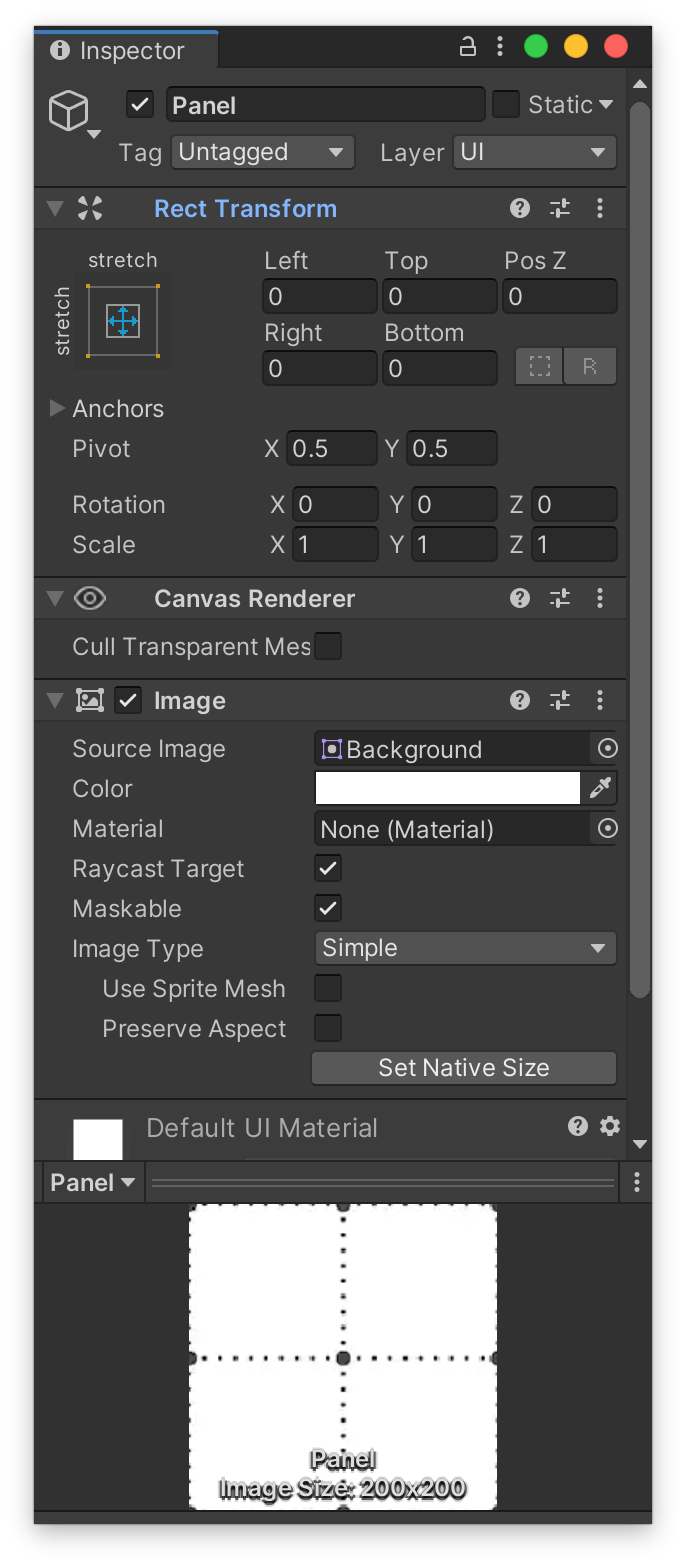
My game is in portrait mode and I have a panel. I want the panel to have a maximum width of 1080 pixels. In cases where the panel doesn't fit on the screen because the aspect ratio is less (like the new iPhone X), I want it to shrink it a bit with a minimum width of 700 pixels. In the case that the screen is larger than 1080p (like the iPad Pro) I want the panel to have the maximum size.
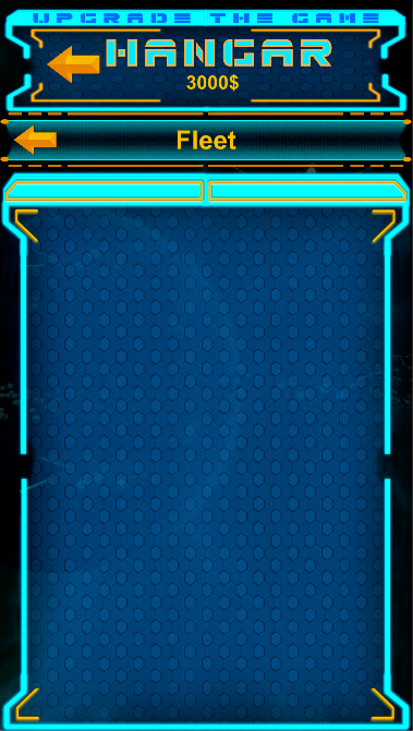
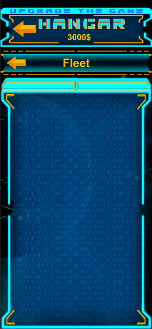
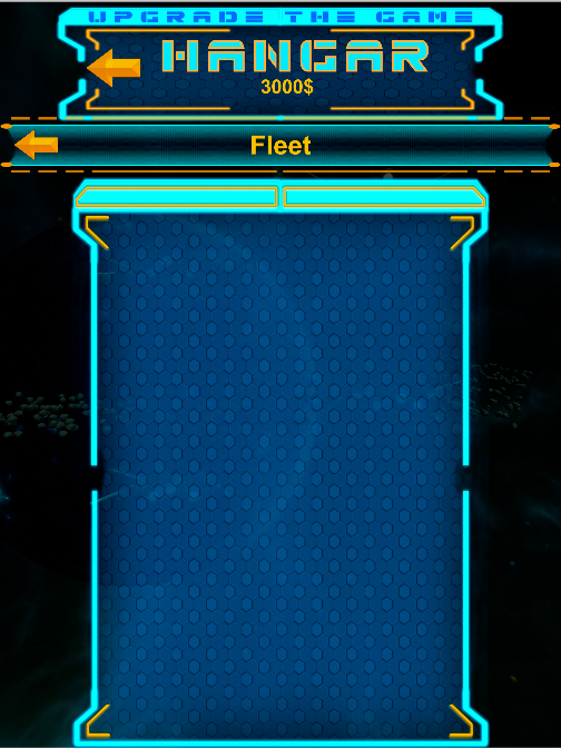
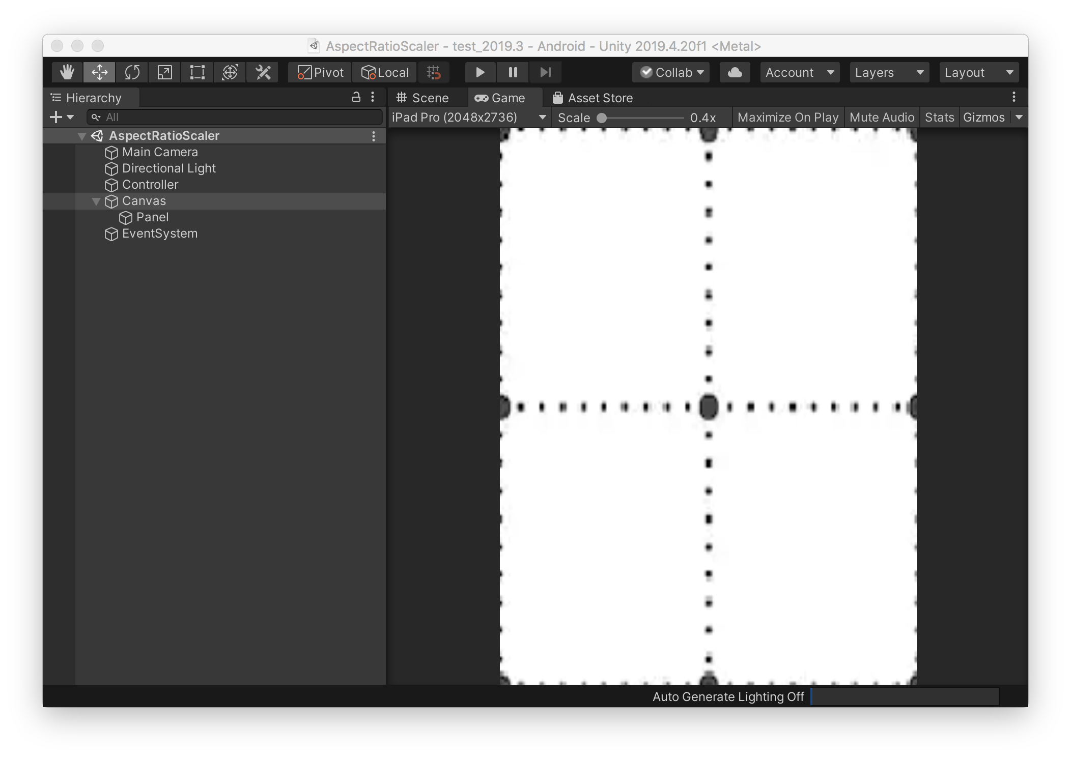
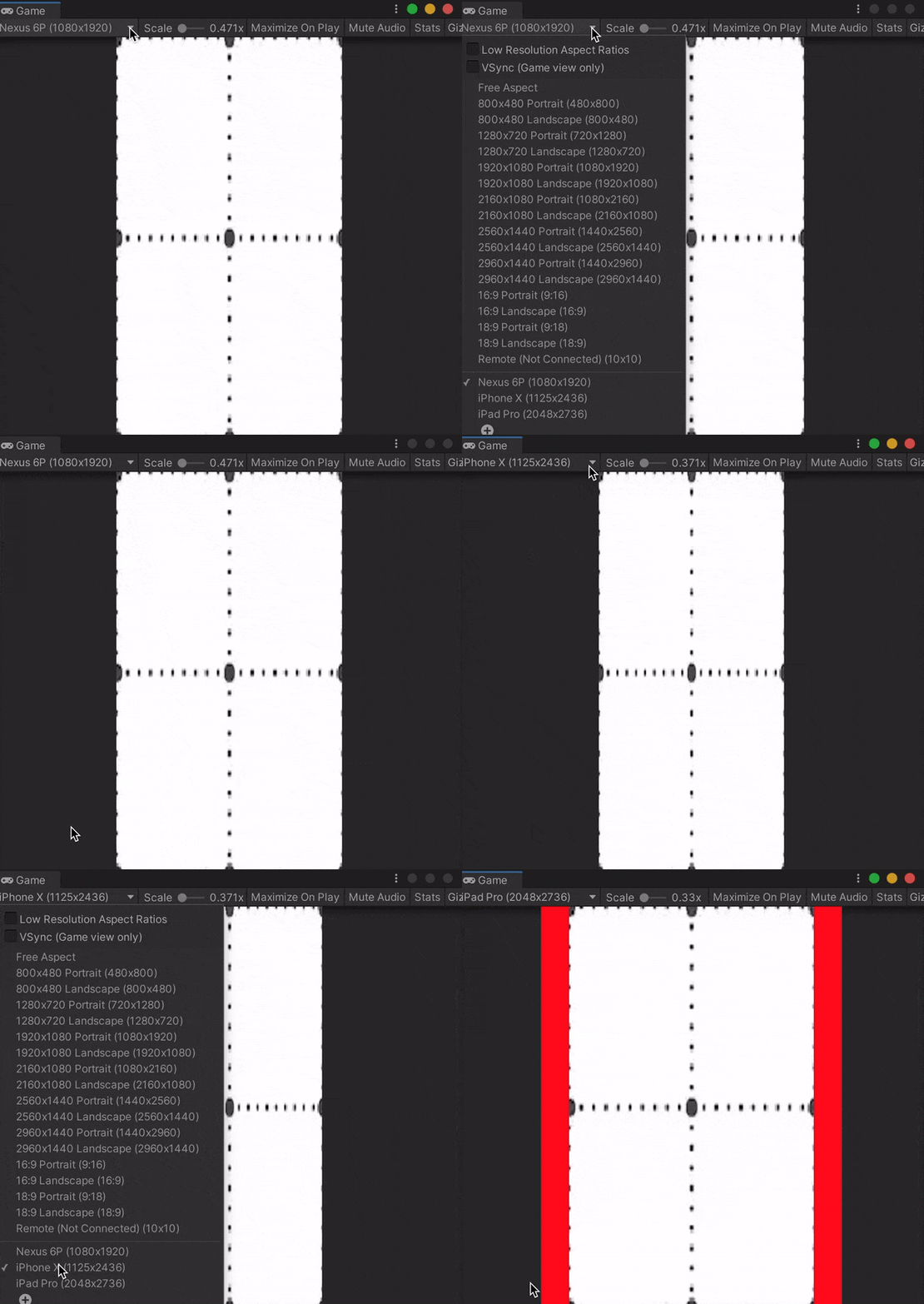
Here are visuals of what I want to achieve:
Nexus 6P ( 1080x1920)
iPhone X(1125x2436)
iPad pro (2048x2732)
I have been playing with Layout Element and Content Size Fitter components without success.
If I set the min width size to 700 pixels and preferred size to 1080 pixels nothing happens (even after setting flexible width.)
If I set the Content Size Fitter to the preferred size it just always reverts to the preferred size. The same thing happens with min.
How do these components work, and how I can achieve the desired effect?
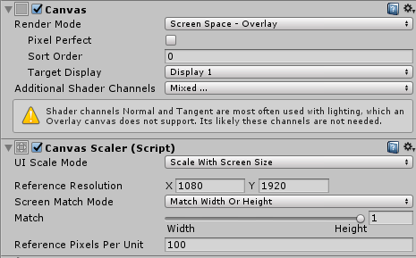
Canvas configuration:

