I am designing a hint system for a "game".
The game is an interactive art simulation for multi-touch and although it is rather intuitive to figure out the basics of how to run that simulation there are some more complicated things to it that I would like to help the user discover.
My design rules are that it needs to be abstract and mostly transparent. There can be no sounds or words to this hint system. I am hesitant to use symbols as well. I realize this makes it quite difficult to effectively communicate with the user but that is sort of the point. It is supposed to be a bit of a puzzle so it is rewarding to solve and in this case it is completely fine if the user does not.
These hints will show up when the user is close to figuring out a new aspect of the simulation. The goal of it is to communicate what the missing piece is for them to get there.
For example on one of the hints I need to get the user to hold a new finger down for more than 1 second under certain conditions.
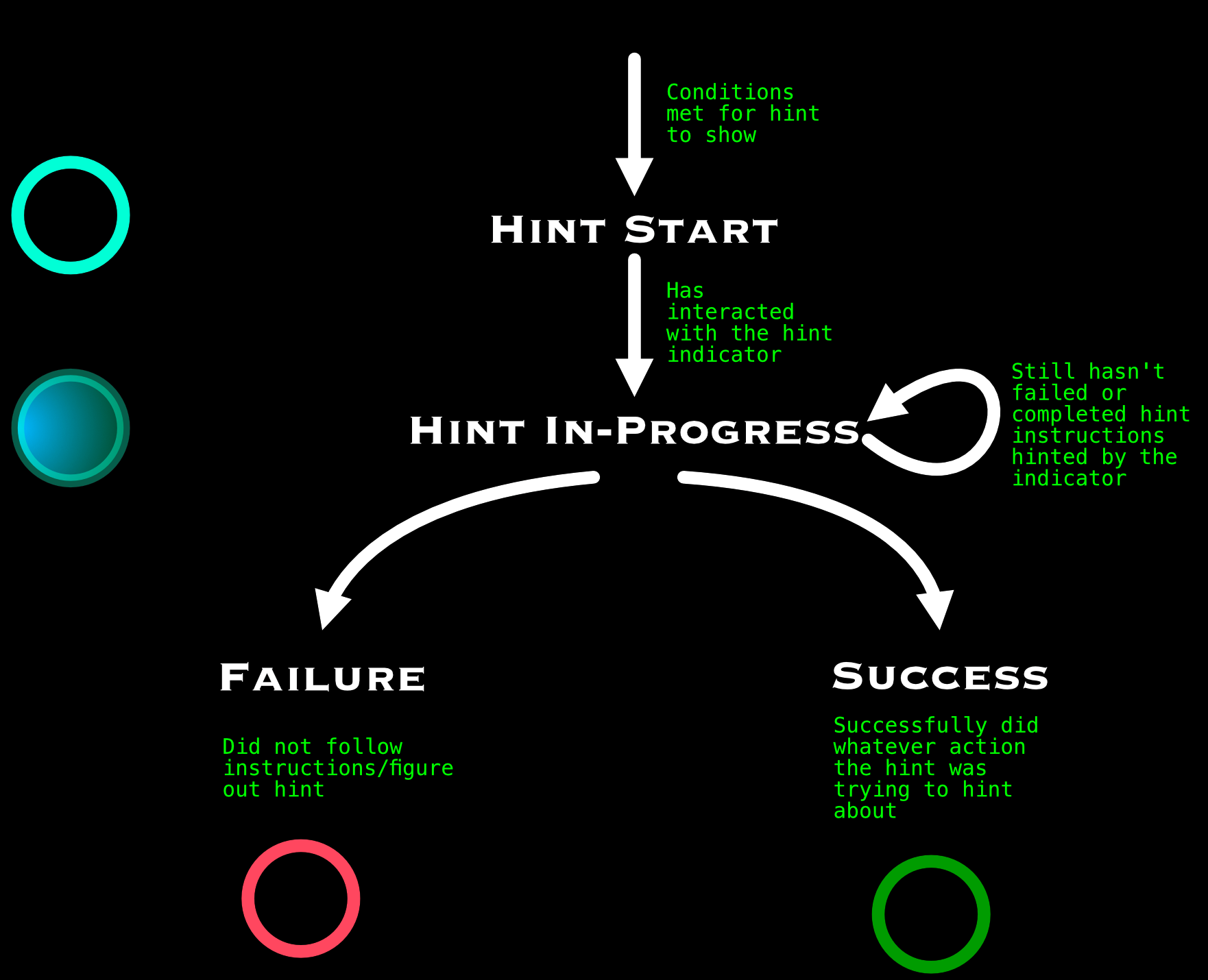
In order to communicate this I want to show some sort of indicator. When the user puts their finger on the indicator it reacts communicating that that was a good choice but there is still more to do. If the user lifts their finger before 1 second I want to show some sort of "failure animation" however if the user lifts their finger longer than 1 second I want to show some sort of "success animation". The user would also notice that the behavior of the simulation changed.
I have chosen a ring/circle as the core shape for the indicator. This makes sense because generally a hint appears somewhere they are not touching and they begin being "in progress" once their finger is on the indicator. I am good with shaders so I will make it look better later.
So far the hint has been reading but I am concerned about how clear it is whether they failed or were successful at executing whatever the hint was hinting about. I have thought about having the indicator turn "green" for good or "red" for bad but the problem here is that color scheme isn't universal. AND most critically it begs the question of what a "neutral" color is/should be for the indicator before the user has started on the hint and while they are doing it and the indicator is following their finger. Teal was my gut instinct but that color is already pretty close to green. I am worried about the use of just color and specifically the colors red/green so I am looking for other ideas on how I might be able to get this indicator to communicate success or failure following the rules at the top.
Are there other ways I could communicate success/failure?
In addition does anyone know of any other games/projects that use a non-verbal/written hint system communicating more abstractly/with colors? Would be good to have some reference. Any related articles are great too.
Here is sort of a state diagram of the indicator if that helps. I have included a simple/mockup of the indicator with very simple shapes but obviously to give you an idea it will look better. In the holding example the hint would start by being in the state "hint start" somewhere on screen and when the user touches it would transition to "hint in progress". If the user releases before 1 second it would then go to "failure" and turn red but if the user releases after 1 second it would go to "green" for success.

