One thing I'm starting to realize is very important: proper use of contrast.
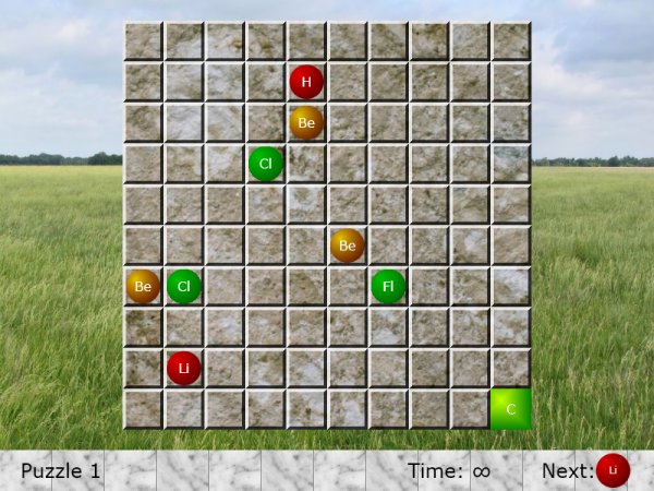
Look at that first picture. It's contrasty all over the place! The sky is bright, the horizon is dark, then the far grass is bright, then the bottom is dark. The tiled background wildly varies between extremely bright and extremely dark. All of this is non-information. Visual clutter. The actual important parts - the circles - are drowned out by all the contrast changes.
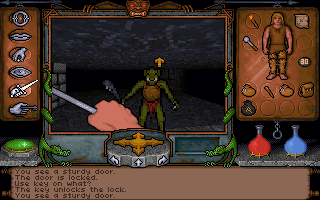
Now look at the second picture. The background is dark and relatively monotone. There's a bright border around the entire playing field. The tiled background is mostly dark, with thin white lines in important locations. Suddenly you can actually see the puzzle, because it's one of the most contrasty things around.
Personally, I would still tweak it a bit - I'd make the playing field look grungier as well. Those white lines to show grid divisions are important, but the human brain is really good at extrapolating straight features, and those could be a lot darker and even broken up a bit.
The big thing that jars me out of that UI is the bottom bar. It's bright, it's in your face, and it's hard to read the text. That last bit is important - the reason it's hard to read the text is, again, because of contrast. We read text partially by looking for the edge of letters, but the letters blend in unfortunately well with parts of the bottom bar.
What I would do: Rejigger the bottom bar to fit well with the main background, in terms of contrast. Make a lighter border between it and the main background to get across the fact that it's separate. Then get rid of most of the text. "Diamond" can become an actual diamond. "Atoms left" can become a pictorial view of a few atoms. "Time left" can become an hourglass or a wristwatch or a pocketwatch. "Next" can go away entirely - you say "you have to play through to see which atoms you get", but that's an annoying game mechanic. Turn it into a stack of atoms on the right, sitting on a beat-up conveyor belt, with a little visual machinery clue for which the next one in the line is. Tada! Puzzle improved, interface improved, everything looks less cluttered.
If you do need to use text, there's two ways to guarantee contrast. First, put your text on something which is, itself, low-contrast. If it's got a dark background, use light text. If it's got a light background, use dark text. If you can't do that (and sometimes you just can't), don't hesitate to use the outer glow effect. It's a great way to provide the right border contrast no matter what your text is on.
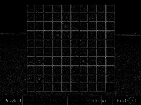
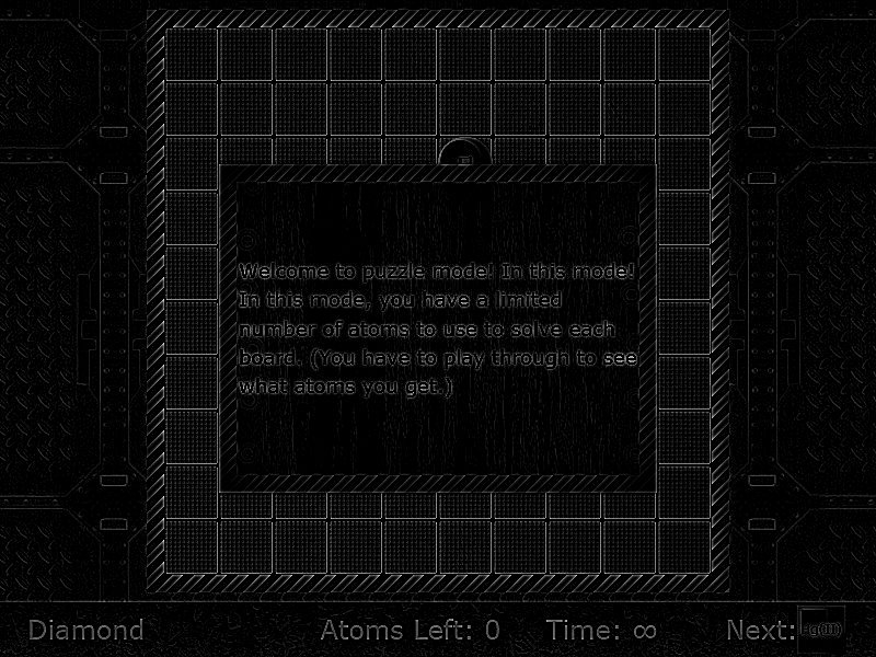
When you're playing with interfaces, open up an image editor, swap it to monochrome, and try two things: blur, and edge detect. When your UI is monchrome blurred, your vision should automatically gravitate to the important areas. When it's on edge-detect, the important areas should be highlighted. Examples:


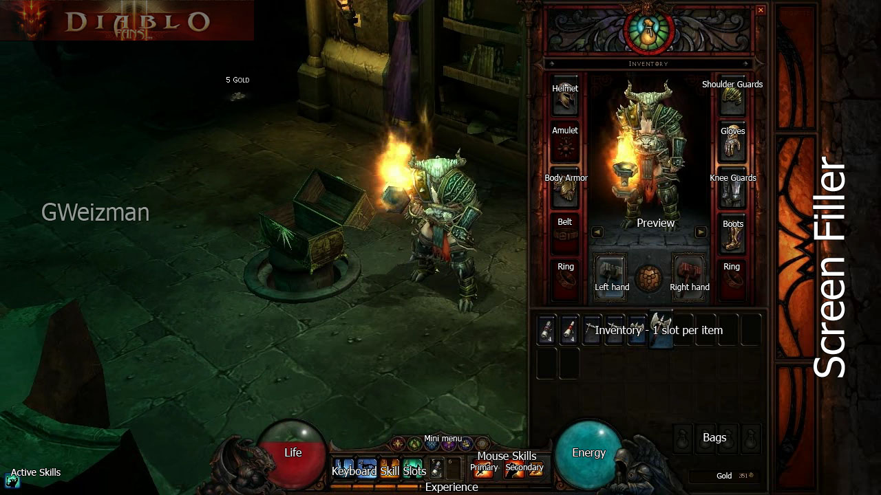
Compare these two. The first one is nearly unreadable - sure, some of the gems are visible, but many of them aren't. On the second one, the grid stands out instantly, as does the dialog box. While there's only one gem on the board, you can instantly see where it is.


The first one massively emphasizes the grid edges. Some of the gems are nearly invisible. The second emphasizes those still (and more than I personally would), but it also emphasizes the border of the puzzle very strongly, and the gem is significantly more (though still not perfectly) visible.
This method isn't a panacea by any means, but it can help you track down things that should be fixed. Just keep in mind that human vision is based around edges and contrast, and design your UI to be readable by humans.
